The “Describe Image” task in the PTE exam is known to be quite challenging as it requires candidates to interpret and present visual data accurately and fluently. Among the various image types you may encounter, describing a PTE pie chart can be a bit challenging. But you can easily score high by using the right template and effective strategies.
In this blog, we will break down the best tips, provide a proven template, and share sample questions with answers to help you score high.
PTE Pie Chart Template
Introduction:
Start with explaining about what the pie chart is about. (topic of the chart, e.g., the distribution of various energy sources used worldwide).
Major Observations:
Describe what you are observing in the pie chart.
- The largest segment is (mention the highest category, e.g., Solar energy with 40%), followed by (mention the second-largest, e.g., Wind energy with 25%).
- The smallest portion belongs to (mention the lowest category, e.g., Geothermal energy with 5%).
- Other notable categories include (mention other relevant segments, e.g., Hydro and Biomass, which contribute 15% and 10%, respectively).
Trends & Comparisons:
Speak about the trends or comparisons from extracting the data.
- Mention a key trend, e.g., Renewable energy sources make up the majority of the distribution.)
- Compare two segments, e.g., Solar energy usage is almost double that of Hydro energy.)
- Highlight any unexpected trend, e.g., despite its potential, Geothermal energy has the least contribution.)
Conclusion:
Overall, the chart indicates (main takeaway, e.g., a growing reliance on renewable energy sources, with Solar being the most dominant).
Proven Tips & Tricks to Excel in PTE Pie Chart Description
Quickly Identify Data
You have 25 seconds to prepare and read main aspects of the pie chart. You can do this by taking note of the following things.
- Title: Look for the topic of the chart
- Majority & Minority: Check sections and know about the highest and lowest percentage.
- Significant Differences: Any major gaps between two categories?
- Equal Segments: Are there any sections with the same percentage?
Example:
“It is evident that the largest energy source is coal at 45%, while the smallest is wind energy at 5%.”
Use Useful Vocabulary and Phrases
While describing the photo, use good vocabulary and connecting phrases. This will help you describe the image effectively.
Comparative Words:
| Category | Comparative Words/Phrases |
| Basic Comparatives (Adjectives & Adverbs) | better, faster, stronger, higher, deeper, wider, larger, longer, heavier, lighter, darker, brighter, softer, harder, smoother, rougher, louder, quieter |
| Weaker Comparatives | worse, slower, weaker, lower, shallower, narrower, smaller, shorter, dimmer, duller |
| Equality Comparisons | as…as, just as, equally |
| Inequality Comparisons | more than, less than, not as…as |
| Progressive Comparisons | getting better, becoming worse, growing stronger, becoming weaker |
| Degree of Comparison | somewhat better, significantly faster, slightly weaker, far more interesting, much less effective |
| Cause & Effect Comparisons | the more…the more (e.g., “The more you practice, the better you get”), the less…the less |
Descriptive Phrases:
| Category | Descriptive Phrases |
| Overall Description | The pie chart illustrates…, The given chart represents…, The data is divided into…, The chart provides an overview of… |
| Largest Segment | The largest portion accounts for…, The majority of the chart is taken up by…, The most significant share belongs to… |
| Smallest Segment | The smallest fraction is…, A minor percentage is allocated to…, The least significant section represents… |
| Comparison Between Sections | X is twice as large as Y…, The percentage of A is slightly higher than B…, There is a significant gap between… |
| Proportions & Percentages | Approximately one-third of the chart…, Nearly half of the total…, A small fraction of…, A considerable proportion… |
| Trends & Insights | The data suggests that…, This indicates a preference for…, The distribution highlights…, A clear trend can be seen in… |
| Changes Over Time (if applicable) | Over the years, the share of X has increased…, There is a noticeable decline in…, The proportion of Y has remained stable… |
Example:
“The largest portion is occupied by fossil fuels at 55%, whereas renewable sources contribute only 15%.”
Speak at a Natural Pace
Many test takers speak too fast because of time constraints. Avoid talking too fast or too slow, maintain a moderate pace, and avoid using fillers like “um,” “uh,” or “you know.”
- Read aloud from books or articles daily to improve fluency.
Focus on Pronunciation & Clarity
PTE’s AI system evaluates your pronunciation, so make sure:
- You pronounce words clearly.
- You stress important words (e.g., “significantly higher”).
- You avoid mispronouncing numbers (e.g., “thirty-five” instead of “thirty-fife”).
Don’t Try to Describe Everything
You don’t need to cover every small detail. Instead, focus on the most important insights.
❌ Bad Example:
- “The chart has five sections. The first section is X with 25%. The second section is Y with 20%. The third section is Z with 15%…”
✅ Good Example:
- “The largest section is X at 25%, followed by Y at 20%. In contrast, Z is the smallest with 15%.”
Utilize Smart Time Management
Since you have only 40 seconds to speak, break your response into sections:
- First 5 seconds: Introduction
- Next 20-25 seconds: Main details (highest, lowest, key comparisons)
- Last 5-10 seconds: Summary
Trick: Use a stopwatch to time your responses and refine your pacing.
End with a Strong Conclusion
A good conclusion wraps up your response smoothly.
Examples:
“In summary, Category A dominates, while Category B remains the least significant.”
“Overall, the pie chart shows that the majority prefers X, while only a few choose Y.”
A strong conclusion leaves a positive impression and makes your response sound complete.
PTE Pie Chart Sample Questions With Answers
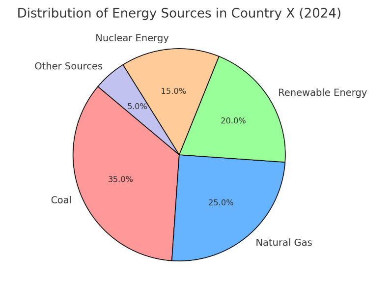
Description:
The pie chart represents the energy distribution in Country X for 2024. Coal is the largest source, making up 35% of the total energy, followed by natural gas at 25%. Renewable energy contributes 20%, reflecting a shift toward sustainability. Nuclear energy accounts for 15%, while other sources make up the smallest portion at 5%. Overall, fossil fuels dominate the energy mix, but renewables hold a significant share. The data indicates that while traditional sources remain prevalent, the country is gradually adopting alternative energy solutions.”
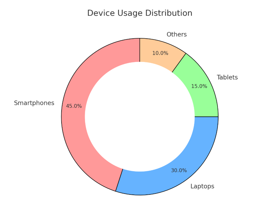
Description:
The pie chart shows the global smartphone market share in 2024. Apple leads the market with 40%, followed by Samsung at 30%. Xiaomi holds a 15% share, while other brands collectively make up the remaining 15%. The data indicates that Apple and Samsung dominate the industry, while smaller brands compete for a limited market share

Description:
The chart represents the distribution of app feature usage. Messaging is the most frequently used feature at 30%, followed by social media at 25% and video streaming at 20%. News reading accounts for 15%, while online shopping has the lowest usage at 10%. The data suggests that communication and entertainment features dominate app usage, while shopping and reading are less frequently used.
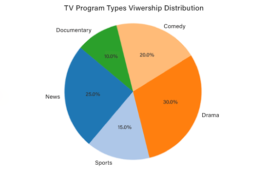
Description:
The pie chart represents the viewership distribution across different types of TV programs. Drama has the highest viewership at 30%, followed by news at 25%. Comedy accounts for 20%, while sports contribute 15%. Documentaries have the lowest viewership at 10%. The data suggests that entertainment-oriented genres, such as drama and comedy, attract the largest audiences, while factual content like documentaries has a comparatively smaller viewership.
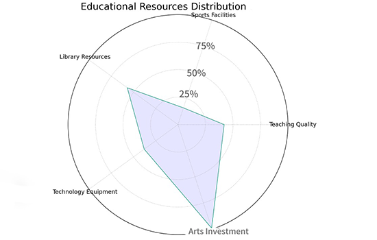
Description:
The radar chart illustrates the allocation of educational resources across various categories. Library resources and teaching quality receive moderate investment, while technology equipment and sports facilities are comparatively lower. The least investment is observed in arts. The chart suggests that educational institutions prioritize fundamental academic resources over extracurricular and creative areas.

Description:
The pie chart illustrates the daily time allocation for various activities. Sleep and work each account for the largest share at 33.3%, followed by leisure at 16.7%. Eating represents 8.3%, while commuting and exercise contribute the least at 4.2% each. The data suggests that people spend most of their day sleeping and working, while leisure and other activities occupy a smaller portion of the daily schedule.
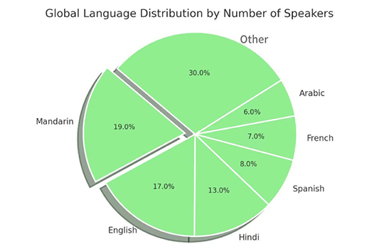
Description:
The pie chart represents the proportion of global speakers for different languages. “Other” languages account for the largest share at 30%, followed by Mandarin at 19% and English at 17%. Hindi and Spanish make up 13% and 8%, respectively, while French and Arabic hold smaller shares at 7% and 6%. The chart highlights that a diverse range of languages are spoken globally, with Mandarin and English being the most dominant.

Description:
The donut chart represents the nutritional breakdown of food. Vitamins form the largest portion at 33.3%, followed by minerals at 28%. Protein and fats each contribute around 10.7%, while fiber accounts for 9.3%. Carbohydrates make up the smallest share at 8%. The data highlights the essential role of vitamins and minerals in a balanced diet.

Description:
This pie chart visualizes the distribution of national energy consumption across different sources. The largest share, 33%, is attributed to renewable energy, followed by nuclear energy at 25.3%. Coal and natural gas contribute 16.5% and 11%, respectively, while hydroelectric power accounts for 7.7%. The smallest portion of energy consumption comes from oil, making up just 6.6% of the total.

Description:
This side-by-side pie chart compares movie genre preferences between teenagers and adults. For teens, drama (28%) is the most preferred genre, followed by action (20%) and animation (18%). In contrast, adults favour drama (31.8%) more prominently, with action (27.3%) ranking second. Documentary and romance genres hold smaller shares among both age groups, indicating variations in cinematic preferences based on age demographics.
These practice questions alone may not be enough to achieve your target score. To improve your chances, practice as much as possible. Gurully offers a comprehensive platform where you can take full-length mock and section-wise tests to strengthen your weak areas. Instant scoring allows you to evaluate your performance like in an actual exam. Take one free mock test and prepare for the PTE exam today.
Conclusion:
PTE Pie Chart description may seem challenging initially, but with the right approach and strategies, you can confidently tackle this task and score high. Following this blog’s proven tips and templates, you can develop a structured and effective response that impresses the PTE scoring system.
To make your preparation even more efficient, consider using Gurully as your practice platform. It offers a wide range of PTE mock tests and sample questions to help you build confidence.
For more updates and sample questions keep on following 79score.com!
Also Read:
- PTE Re-tell Lecture Sample Question With Answers For Practice
- PTE Summarize Written Text Template & Sample Questions With High Scoring Answers
- Know All About PTE Score Chart To Set Target For 2025
- PTE Describe Image Template 2025 – Tips, Predictive Question & Answer
|
79Score
|


